You do not need a full redesign to sell more online. Focus on clear calls to action, faster load times, trust signals, simplified forms, and mobile-friendly design. These small changes compound into measurable sales growth.
You spend time and money attracting visitors to your website, but if those visitors leave without buying, signing up, or contacting you, that traffic is wasted. Conversion rate optimization (CRO) is the practice of turning more of your existing visitors into customers, and the good news is that you rarely need a complete redesign to see results.
In fact, some of the most effective improvements are surprisingly small. A clearer button, a faster page, or a shorter form can noticeably lift your sales. In this guide, you will learn practical, high-impact changes you can apply to your website to boost conversions, often without writing a single line of code.
Why Small Changes Matter More Than You Think
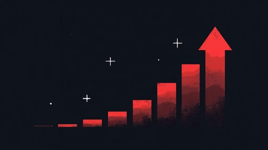
Conversion optimization is a numbers game. If your website converts at 2% and you double it to 4%, you have doubled your revenue from the same amount of traffic. You did not spend more on advertising. You simply made better use of the visitors you already had.
This is what makes CRO so valuable for small and mid-sized businesses. You may not have the budget to compete with larger companies on ad spend, but you can compete on how effectively your website turns interest into action.
The key is to stop guessing and start removing friction. Every unnecessary step, confusing message, or moment of doubt gives a potential customer a reason to leave. Your job is to make the path to purchase as smooth and obvious as possible.
Make Your Calls to Action Impossible to Miss
Your call to action (CTA) is the moment you ask a visitor to do something: buy now, book a call, start a free trial, or request a quote. If your CTAs are weak or hidden, your conversions suffer.
Here are simple improvements that consistently work:
- Use action-focused language. Replace vague labels like "Submit" or "Learn More" with specific phrases such as "Get My Free Quote" or "Start Selling Today." Tell visitors exactly what they get.
- Make buttons stand out. Use a color that contrasts with the rest of your page so the button draws the eye. Buttons should look clickable, not blend into the background.
- Place CTAs where decisions happen. Add a clear call to action near the top of the page, after key benefits, and at the end of your content. Do not make visitors scroll back up to find it.
- Reduce choices. When you give people too many options, they often choose nothing. Focus each page on one primary action.
A single, confident CTA repeated at the right moments usually outperforms a page cluttered with competing links.
Speed Up Your Website
Page speed has a direct impact on sales. Visitors expect pages to load almost instantly, and every extra second of delay increases the chance they abandon your site before it even finishes loading. Slow pages also hurt your search rankings, which means fewer visitors in the first place.
You can make meaningful speed gains without a technical overhaul:
- Compress and resize images. Large image files are the most common cause of slow pages. Use optimized, properly sized images instead of uploading full-resolution photos.
- Remove unused plugins and scripts. Extra tools you no longer use can slow everything down. Audit your site and delete what you do not need.
- Use reliable hosting. Cheap, overcrowded hosting can throttle your performance. Investing in quality hosting often pays for itself in better conversions.
- Enable caching. Caching stores a version of your pages so they load faster for returning visitors.
Test your site speed with free tools and treat anything slower than a few seconds as a problem worth fixing.
Build Trust at Every Step
People buy from businesses they trust. If your website looks outdated, lacks proof, or feels risky, visitors hesitate. Adding trust signals is one of the quickest ways to improve conversions.
Consider these additions:
- Customer reviews and testimonials. Real feedback from real customers reassures new buyers. Place testimonials near your CTAs and on product or service pages.
- Trust badges and security indicators. Show secure payment icons, guarantees, and any certifications relevant to your industry. For online stores, visible security cues reduce checkout anxiety.
- Clear contact information. A phone number, email, or physical address signals that you are a real, accountable business.
- Case studies and results. If you can show measurable outcomes you have delivered for other clients, do it. Specific numbers are far more persuasive than vague claims.
Small reassurances add up. When visitors feel confident that you are legitimate and that others have had good experiences, they are far more likely to act.
Simplify Your Forms and Checkout
Forms are where many conversions are won or lost. Every field you ask someone to fill in is a small barrier, and the longer the form, the more people give up.
To reduce abandonment:
- Ask for less. Only request the information you genuinely need right now. You can always gather more later. For a first contact, a name and email are often enough.
- Use clear labels and helpful error messages. If someone makes a mistake, tell them exactly what to fix instead of showing a confusing error.
- Offer guest checkout. Forcing shoppers to create an account before buying is a major reason for abandoned carts. Let people buy quickly and offer account creation afterward.
- Show progress. For multi-step checkouts, a simple progress indicator helps people see how close they are to finishing.
Every field you remove and every step you simplify can recover sales that would otherwise be lost.
Optimize for Mobile Visitors
A large share of your traffic likely comes from mobile devices, and these visitors behave differently. Small screens, touch navigation, and on-the-go browsing mean your mobile experience must be effortless.
Focus on the essentials:
- Make buttons large and easy to tap. Tiny links frustrate mobile users. Give important actions plenty of space.
- Keep forms short. Typing on a phone is tedious, so mobile users abandon long forms even faster.
- Ensure text is readable without zooming. Use comfortable font sizes and clear spacing.
- Test the full journey. Go through your own site on a phone, from landing page to purchase, and fix anything that feels awkward.
If your mobile experience is clumsy, you are losing a significant portion of your potential customers before they ever consider buying.
Test, Measure, and Keep Improving
Conversion optimization is not a one-time project. The most successful businesses treat it as an ongoing habit. Start by measuring your current performance so you know where you stand, then make one change at a time and watch how it affects results.
Simple ways to stay data-driven:
- Track your conversion rate. Know how many visitors turn into leads or customers before and after changes.
- Use analytics to find drop-off points. Identify where visitors leave so you can focus your effort where it matters most.
- Run A/B tests. Compare two versions of a page or button to see which performs better, rather than relying on opinion.
By changing one element at a time, you learn what actually moves the needle for your audience instead of guessing.
Conclusion
You do not need a massive budget or a full website rebuild to sell more online. Conversion optimization is about removing friction and giving visitors clear, confident reasons to act. Sharper calls to action, faster pages, stronger trust signals, simpler forms, and a smooth mobile experience are all changes you can start on today.
Pick one area from this guide, make the improvement, and measure the result. Then move on to the next. These small changes compound over time, turning your existing traffic into a reliable source of growth.
If you want expert help turning your website into a consistent sales engine, our team at Beeglantee can audit your site, identify your biggest conversion opportunities, and implement the changes for you. Reach out today and start converting more of the visitors you already have.