Studija slučaja · Brending
Personal trainer Šolaja Miloš
Personal trainer rebrand through sharp geometry and an emerald palette
- Klijent
- Šolaja Miloš
- Industrija
- Fitness and health
- Godina
- 2025
- Trajanje
- 30 days
Polazna tačka
Izazov
Šolaja worked as a personal trainer without a clear visual identity to set him apart in a competitive fitness market.
What wasn't working
- No logo - clients couldn't recognize him or recommend him to others
- Generic communication - he used standard fitness phrases with no personal touch
- Inconsistent materials - every post or document looked different
- Weak memorability - the Šolaja name got lost among competitors
The end result
Without a recognizable brand, Šolaja was losing potential clients who were looking for a professional trainer with a clear identity.
Naš pristup
Rešenje
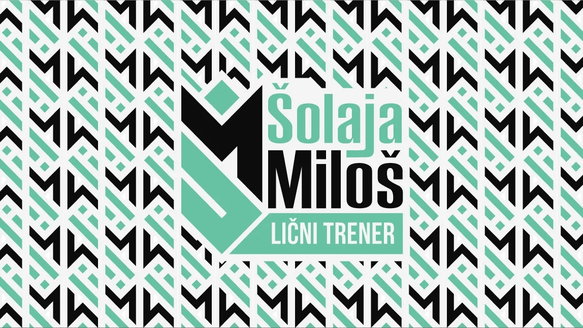
We developed a sharp, geometric identity that puts the focus on the letter M as the central recognizable mark.
Identity moves
- Geometric logo - the letter M with sharp edges as a strong visual anchor
- Emerald palette - #66C2A2 as the main color that stands out from the typical reds and blues
- Built Titling font - an industrial character that reflects the seriousness of the training
- Minimalist application - a black and white combination with emerald accents
The effect
The new identity lets Šolaja build a recognizable personal brand through consistent visuals.
Tipografija
Glasovi brenda u pikselima
Primary
Built titling
Built Titling is an all-caps display font created by Canadian designer Raymond Larabie of Typodermic Fonts, designed specifically for building firm, compact headlines on screen.
Strengths
- Compact firmness: Solid proportions and subtle curves deliver authority and clarity across five weights from Extra-Light to Bold, ideal for a fitness brand that needs to convey strength and reliability
- Smart scaling: The font gets narrower as it gets lighter, which allows large headlines without worrying that words won't fit on a line - a practical advantage for web and mobile apps
- Neutral trust: Designed with trust and neutrality in mind, the wraparound shapes speak in a journalistic voice with a subtle curve that evokes a different era of newsprint
Tone of voice
When Šolaja uses Built Titling, the brand sounds authoritative and approachable - like an expert fitness trainer who shares knowledge clearly and directly.
Best for
- Primary headlines: The all-caps format and firm construction are ideal for main headlines on the website and in the app
- Call-to-action buttons: Its compact nature keeps clarity even at smaller sizes on sign-up or booking buttons
- Branding materials: Five weights (from Extra-Light to Bold) offer flexibility for a range of branding needs - from logotype to packaging
Secondary
Roboto
Roboto is a grotesque sans serif created by Christian Robertson for Google in 2011, with a dual nature that combines the mechanical skeleton of geometric forms with friendly, open curves. It's ideal for secondary elements of a fitness brand looking for a modern, approachable tone.
Strengths
- Legibility on every device - it was designed for Android systems and high legibility on digital screens
- Natural reading rhythm - it doesn't force rigid geometry but lets letters settle into their natural width
- Flexibility - available in a wide range of weights from Thin to Black, plus Condensed variants
Tone of voice
A brand that uses Roboto sounds technologically aware, accessible, and reliable - perfect for a fitness industry that combines science with practical results.
Best for
- Secondary text such as descriptions, product specifications, nutritional information
- Long body copy in blogs or apps thanks to its natural reading rhythm
- UI elements that require clarity and neutrality
Paleta boja
DNK identiteta, kliknite za detalje
Emerald
PrimaryEmerald #66C2A2 is a natural choice for a fitness brand because it immediately evokes vitality and recovery - colors that are key in that industry.
What it conveys
- Health and nature - green is universally linked to wellbeing and organic energy, which speaks directly to your focus
- Freshness and regeneration - this warm emerald suggests active body renewal, not just burning energy
- Reliability - green is more stable than red, which makes clients feel you're a serious partner in their transformation
- A break from red - while many fitness brands use red for aggression, you stand out as a brand that understands a holistic approach to health
The feelings it stirs
Emerald is calming, but not passive. It makes people feel like they're doing something smart for themselves, not like they're suffering. That's a big difference in a fitness industry dominated by aggressive psychology.
Best for
- Primary CTA buttons - "Start training", "Book a session" - emerald is inviting enough to draw attention without being aggressive
- Header sections and icons - it builds excellent visual hierarchy without tiring the eye
- Accent for progress indicators - green naturally signals "going well", which is perfect for motivational elements
Black
SecondaryBlack #050505 is an ideal choice for a secondary element of Šolaja's visual identity because it creates contrast and firmness across the brand's communication, while reinforcing the perception of professionalism and control.
What it conveys
- Control and discipline - black is the color of determination, essential in a fitness industry where regular practice and consistency are the basis of results
- Sophistication - as a secondary color, black never goes out of fashion and makes a design look mature rather than trend-driven
- Contrast - it ensures clear legibility of text, buttons, and action elements, which matters for the user experience
- Focus - it reduces visual noise and lets the primary color and message stand out more clearly
The feelings it stirs
In a fitness context, black doesn't feel cold or distancing but rather assured and competent. Clients feel like they're in the hands of an expert who knows what they're doing. That mix of formality and strength strengthens trust in the program and the results.
Best for
- CTA buttons - "Sign up" or "Get started" buttons in black carry clear action and don't interfere with the primary design
- Headings and sections - black labels separate content and make navigation easier
- Text and details - fonts, icons, and borders that reinforce structure without dominating
Ivory
Secondary#F6F7F7 is a soft, neutral ivory that provides visual rest without dominating. For a secondary role it's a perfect solution because it lets the main colors shine while keeping the interface readable and modern.
What it conveys
- Cleanliness and hygiene - key for fitness and health, it makes a space feel healthy and safe
- Minimalism - a modern, unpretentious aesthetic that doesn't distract
- Openness - the light color visually expands the space and makes the design bright and pleasant
- Professionalism - its neutrality gives it credibility without aggression
The feelings it stirs
Ivory is discreet, almost neutral - it doesn't make a dramatic impression but quietly builds trust. In health and fitness that's an advantage: if a user sits between the main color and #F6F7F7, the eyes drift slightly away from stark white paper, which improves readability.
Best for
- Backgrounds for secondary components - cards, panels, groups of controls that aren't the main focus
- Dividers and lines - a thin border in this color separates sections without visual noise
- Text areas or forms - a gentle contrast with black text, easy on the eyes during longer use
Logo concept
The letter M as the central element with sharp geometric lines. A symbol of strength and precision that reflects the approach to personal training.
Glas brenda
A direct and motivating tone of communication. No pretension, focus on results and practical advice.
Identitet uživo
Kako brend deluje u svetu
Fitness and health
Šolaja Miloš
Personal trainer rebrand through sharp geometry and an emerald palette
Fitness and health
Šolaja Miloš
Set u Built titling
2025
Bilbord · Print
Personal trainer rebrand through sharp geometry and an emerald palette
Šolaja Miloš
Moodboard
Vizuelni jezik brenda
Spremni za svoj brend?
Pomoći ćemo Vam da kreirate identitet koji ostavlja utisak. Fontovi, boje, glas i sve što čini brend prepoznatljivim.