Studija slučaja · Brending
PVC stolarija Stanišić Invest
Modern PVC profiles with minimalist design for homes and business spaces.
- Klijent
- Stanišić
- Industrija
- Retail and e-commerce
- Godina
- 2024
- Trajanje
- 30 days
Polazna tačka
Izazov
PVC stolarija faced a typical industry problem - it lacked a differentiating visual identity.
What wasn't working
- Generic visual communication - relying on standard industry colors and typography
- Lack of recognizability - blending in visually with competitors in the local market
- Technical coldness - communication focused on specifications without an emotional component
- Channel inconsistency - a different approach to presentation on the website, catalogs, and field materials
The end result
Without a clear visual identity, the brand was losing recognizability and its connection to the quality it delivers.
Naš pristup
Rešenje
We developed an identity that balances technical precision with approachability through geometric minimalism.
Identity moves
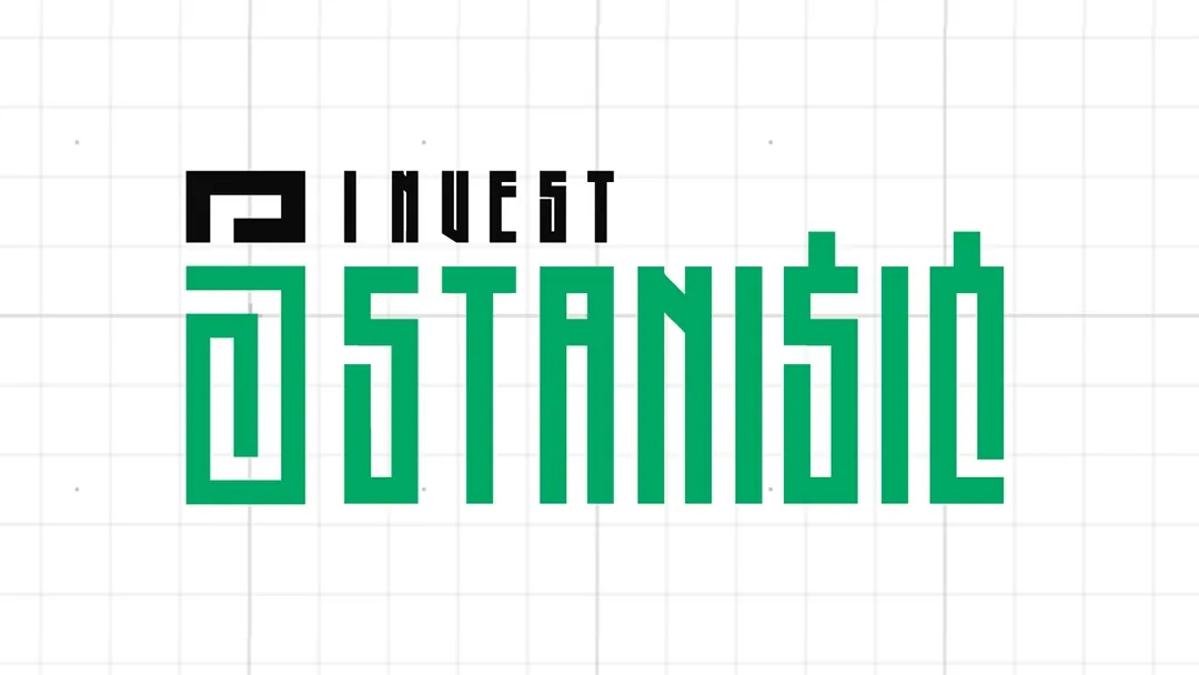
- Geometric logo symbol - a stylized opening representing a window, a direct link to the business
- Jade as the primary color - #00AA66 brings freshness and stands apart from traditional industrial palettes
- Agency FB typography - clean lines that support the logo's geometric approach
- Minimalist aesthetic - a focus on form and function reflects the quality of PVC stolarija
The effect
The identity clearly communicates the precision of the craftsmanship while retaining warmth and approachability toward end users.
Tipografija
Glasovi brenda u pikselima
Primary
Agenci FB
Agency FB is a geometric sans-serif type family intended for titles and headings, created between 1990 and 1995. It was designed by David Berlow of Font Bureau, as an expansion of an all-caps font from the 1930s created by Morris Fuller Benton. It is characterized by geometric precision and narrowed proportions that evoke an Art Deco aesthetic.
Strengths
- Compactness with readability: A dramatically square and narrow font that works best at large sizes for eye-catching display use, especially useful when you have to work in a tight space and short lines
- Modern elegance: A clean, geometric design that evokes a modern yet retro aesthetic, making it popular in editorial design, logos, and advertising
- Family flexibility: It includes 27 styles with five weights - from light to black - in five widths, allowing it to adapt to different needs
Tone of voice
When Stanisic uses Agency FB, the brand sounds like a modern, precise, and reliable retail solution that values efficiency and professionalism in the e-commerce space.
Best for
- Titles and headings: Intended for titles and headings, where its geometric precision and strong visual impact come through
- Display typography: Works best at large sizes for eye-catching display use, ideal for banners and promotional materials
- Compact layouts: One of its virtues is that it takes up very little space yet is quite readable, which is perfect for e-commerce categories and product listings
Secondary
Segoe UI
Segoe UI is a humanist sans serif font designed by Steve Matteson as a friendly and readable font for corporate applications, and it was first introduced with Windows Vista in 2007. With its open, neutral look, this font became Microsoft's standard for user interfaces.
Strengths
- Readability on all screens - It is especially clear and readable for information to be displayed on the screens of desktop, laptop, tablet, or phone devices
- Neutral character - An open, neutral look that works well in both headlines and short passages of text
- Broad functionality - It supports a large number of languages and scripts, including Latin, Greek, Cyrillic, Arabic, and Hebrew
Tone of voice
When Stanisic uses Segoe UI as a secondary font, the brand sounds reliable and technologically aware, with an approach focused on clarity of communication.
Best for
- Labels and descriptions - It is especially suited for labels, captions, signs, and subtitles
- Interface elements - Ideal for navigation, buttons, and helper text on the website
- Short texts - Perfect for product and category descriptions in an e-commerce context
Paleta boja
DNK identiteta, kliknite za detalje
Jade
The color #00AA66 is a vivid, fresh green that signals growth, trust, and relevance - everything customers expect from a modern e-commerce brand. For Stanisic, this shade creates a visual identity that is both professional and approachable.
What it conveys
- Growth and progress - green is the natural color of development, inviting trust in a brand that moves dynamically forward
- Freshness and vitality - the light, warm shade (with a lean toward turquoise) feels more modern than traditional dark greens
- Safety and stability - green is also the color of money and health, which strengthens customer confidence when making a purchase decision
- Environmental awareness - if relevant to the product category, the color associates with responsibility and quality
What feelings it evokes
This green creates a sense of optimism without aggressiveness. Customers perceive it as a positive signal that encourages them to keep browsing and complete a purchase, rather than putting them off or overwhelming them.
Best for
- Purchase buttons (CTA) - the color has enough contrast on white or light backgrounds and is easy to spot without straining
- Deals and discounts - the green "go" energy highlights an offer as a positive opportunity
- Navigation accent - it can guide attention across the site without dominating or overloading the design
Black
SecondaryThe color black #0A0A0A is an ideal choice for the secondary component of the Stanisic brand because it lends elegance and practical functionality without overpowering the main message.
What it conveys
- Sophistication - nearly pure black creates an impression of premium quality and reliability, which is key for e-commerce where customers value clear structure
- Readability and contrast - as a secondary color, black is ideal for text, icons, and buttons because it provides maximum contrast against light backgrounds
- Professionalism - it strengthens every page without being aggressive or distracting, allowing focus on the products
- Neutrality - black doesn't compete with the primary colors but rather reinforces them and keeps the visual identity consistent
What feelings it evokes
Black #0A0A0A is perceived as reliable and serious, without a cold, distant effect. It gives customers a sense of control - element boundaries are clear, navigation is obvious, choices are clear.
Best for
- Navigation elements - header, footer, menu items
- Call-to-action buttons - especially when used on neutral or light backgrounds
- Text hierarchies - product descriptions, prices, details the customer has to read carefully
Ivory
BackgroundThe color #F7F7F7 is an almost neutral white with a slight gray tone - an ideal background that doesn't distract attention from the products or content you're showing.
What it conveys
- Cleanliness and order - a visual foundation that signals professionalism and a reliable approach to business
- Accessibility - enough luminosity for content to be readable without the glare of pure white, especially on mobile screens
- Neutrality - it doesn't introduce colors that would compete with the products in your offering or with brand accents
- Modern minimalism - a recognizable standard for e-commerce pages that look contemporary without extra design
What feelings it evokes
This background creates a sense of trust and order - customers see that you're attentive to detail. The slight grayness (instead of absolute white) makes the page softer on the eyes, which reduces fatigue during longer catalog browsing.
Best for
- Product images - any color of merchandise stands out without competition from the background
- Typography and CTA buttons - dark text and colored buttons will have maximum readability
- Sections and cards - if you add thin borders or white space, the structure becomes clear without a clash of colors
Logo concept
A geometric symbol shaped like a window directly connects the visual identity to the company's business. Sharp, regular lines reflect the precision of PVC stolarija craftsmanship.
Glas brenda
The tone of communication balances technical expertise with approachable language. A focus on quality and durability without pretension or corporate distance.
Identitet uživo
Kako brend deluje u svetu
Retail and e-commerce
Stanišić
Modern PVC profiles with minimalist design for homes and business spaces.
Retail and e-commerce
Stanišić
Set u Agenci FB
2024
Bilbord · Print
Modern PVC profiles with minimalist design for homes and business spaces.
Stanišić
Moodboard
Vizuelni jezik brenda
Spremni za svoj brend?
Pomoći ćemo Vam da kreirate identitet koji ostavlja utisak. Fontovi, boje, glas i sve što čini brend prepoznatljivim.