Studija slučaja · Brending
Bankruptcy Trustee Dr Stojković Predrag
Visual authority for a bankruptcy trustee through a professional identity
- Klijent
- Dr Stojković Predrag
- Industrija
- Finance and consulting
- Godina
- 2026
- Trajanje
- 30 days
Polazna tačka
Izazov
Bankruptcy management demands an exceptionally high level of trust from clients who are in difficult financial situations.
What wasn't working
- Undefined visual identity - no recognizable visual communication that builds authority
- Generic service presentation - a standard approach that gets lost among competitors
- Lack of personalization - a personal name as a brand stays unused for differentiation
- Weak digital recognition - inconsistent communication across digital channels
The end result
The absence of a clear visual identity leads to weak recognition in a market where trust is key.
Naš pristup
Rešenje
We focused on building visual authority through a sophisticated approach to personal branding.
Identity moves
- Westgate as the primary font - luxurious typography that communicates seriousness and expertise
- Royal blue palette - #1D66FF as a symbol of trust and financial stability
- Personalized logo treatment - first and last name as the central element of the identity
- Consistent visual language - tailored to the needs of B2B communication in finance
The effect
The created identity positions the bankruptcy trustee as a reliable professional with clear visual differentiation.
Tipografija
Glasovi brenda u pikselima
Primary
Westgate
Westgate is a sans serif font that belongs to the category of Art Deco condensed fonts, created by Behalf Studio. The font carries an elegant condensed form inspired by the Art Deco style of the early years of the 20th century, and it is characterized by an elongated letter height combined with geometric lines and forms.
Strengths
- Professional legibility: It is very versatile and works excellently at large and small sizes, which is key for financial documents and presentations
- Authoritative tone: The combination of Art Deco elegance with geometric lines projects reliability and stability
- Spatial efficiency: The condensed character makes letters narrower than usual, giving a luxurious, elegant, and sophisticated look while saving space in the layout
Tone of voice
When your consulting brand uses Westgate, it sounds like a reliable advisor who combines traditional financial wisdom with a modern approach - stable, but not outdated.
Best for
- Titles and headlines: Excellent for branding, headlines, magazines and financial reports
- Logos and branded materials: Perfect for logos, branding, packaging and business cards
- Presentations and documents: Working at large and small sizes makes it ideal for all communication formats
Font
Roboto
Roboto is a neo-grotesque sans serif font that was designed by Christian Robertson for Google in 2011. The font has a dual nature - a geometric skeleton combined with friendly and open curves, which allows it to be modern yet approachable.
Strengths
- Exceptional legibility - It has been confirmed in laboratory studies that Roboto shows good on-screen legibility, while its clean lines and open shapes make it highly readable
- Professionalism without coldness - It has a mechanical skeleton with geometric shapes, but at the same time it has friendly and open curves
- Technical adaptability - Available in a wide range of weights from Thin (100) to Black (900) and supports 16 different weights with advanced typographic features
Tone of voice
Roboto gives your brand a voice that is expert and reliable, but also approachable - it sounds like an advisor who knows the subject, not a cold institution.
Best for
- Digital platforms - The font is the cornerstone of Google's Material Design system and optimized for a wide range of screens
- Financial documents - The United Nations uses Roboto on its website and in official documents
- UI and web applications - It is widely adopted as a go-to choice for web designers due to over 200 billion views and use on millions of web pages
Paleta boja
DNK identiteta, kliknite za detalje
Royal blue
PrimaryThe royal blue color #1D66FF is ideal as the primary color for Stojković Predrag because it immediately communicates reliability and professionalism - the key values in the financial sector. This shade is neither cold nor distant; it has enough brightness to carry authority without a cold, bureaucratic tone.
What it conveys
- Reliability - Blue is the standard color of the financial world because clients understand it signals conservatism and seriousness. People instinctively associate blue with banks, insurance, and serious money decisions.
- Professionalism - The color is saturated and vivid enough to feel modern, without any retro-formal stiffness.
- Intellectual power - It suggests analytical thinking and expertise, which is exactly what consulting needs to project.
- Distinctiveness - #1D66FF is specific enough not to be a generic corporate blue; it has character and energy.
What feelings it evokes
This color makes clients feel safe discussing sensitive financial topics. It generates a combination of trust and approachability - they are not put off or intimidated, but see knowledge and experience behind the brand. At the same time, the brighter saturation makes the approach feel open, not rigid.
Best for
- CTA buttons and key actions - Invites a click without aggression, with a clear focus.
- Main headings and headlines - Dominates the page and draws attention while keeping seriousness.
- Accents on infographics and diagrams - Makes complex financial data visually clearer and easier to follow.
Ivory
SecondaryThe color #F6F7F7 (Ivory) is an ideal choice for the secondary palette of a financial brand because it provides cleanliness and professionalism without aggression. This neutral, very light shade makes the entire visual system more approachable and easier to apply across various media.
What it conveys
- Reliability - A light gray like ivory signals stability and a dependable approach, which is fundamental to the financial industry
- Simplicity - A clean, minimalist color gives a sense of order and organization needed in consulting work
- Accessibility - It is light enough to provide good contrast with dark text or accent colors, keeping content readable
- Neutrality - As a secondary color, it doesn't compete with the primary one but reinforces it and connects visual elements
What feelings it evokes
This color creates a sense of order, reflection, and an intellectual approach. It is neither cold nor distant - it implies there is room for conversation and understanding, which is key for a consultant who needs to be available to clients.
Logo concept
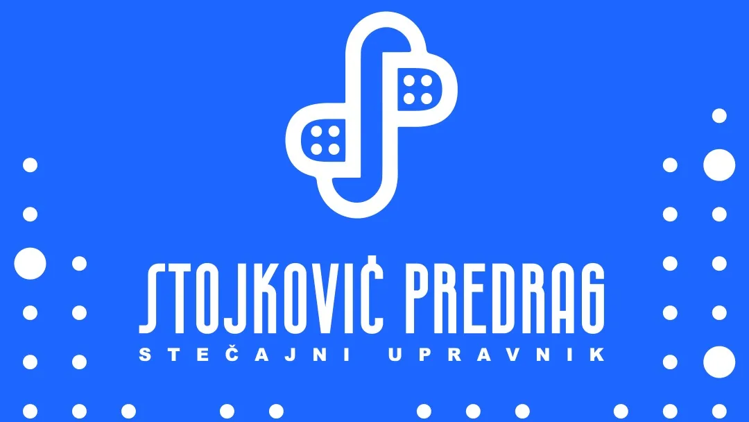
The logo uses the personal name as the central brand element, with the Westgate font that communicates luxury and seriousness. The royal blue color builds trust and authority.
Glas brenda
A professional, reliable tone of communication that balances expertise with approachability. A direct approach that builds trust through clarity.
Identitet uživo
Kako brend deluje u svetu
Finance and consulting
Dr Stojković Predrag
Visual authority for a bankruptcy trustee through a professional identity
Finance and consulting
Dr Stojković Predrag
Set u Westgate
2026
Bilbord · Print
Visual authority for a bankruptcy trustee through a professional identity
Dr Stojković Predrag
Moodboard
Vizuelni jezik brenda
Spremni za svoj brend?
Pomoći ćemo Vam da kreirate identitet koji ostavlja utisak. Fontovi, boje, glas i sve što čini brend prepoznatljivim.