A 1% to 3% conversion jump comes from fixing friction, clarifying your message, building trust, and testing systematically. Focus on high-intent pages, simplify forms, strengthen your calls to action, and use data to guide every change rather than guessing.
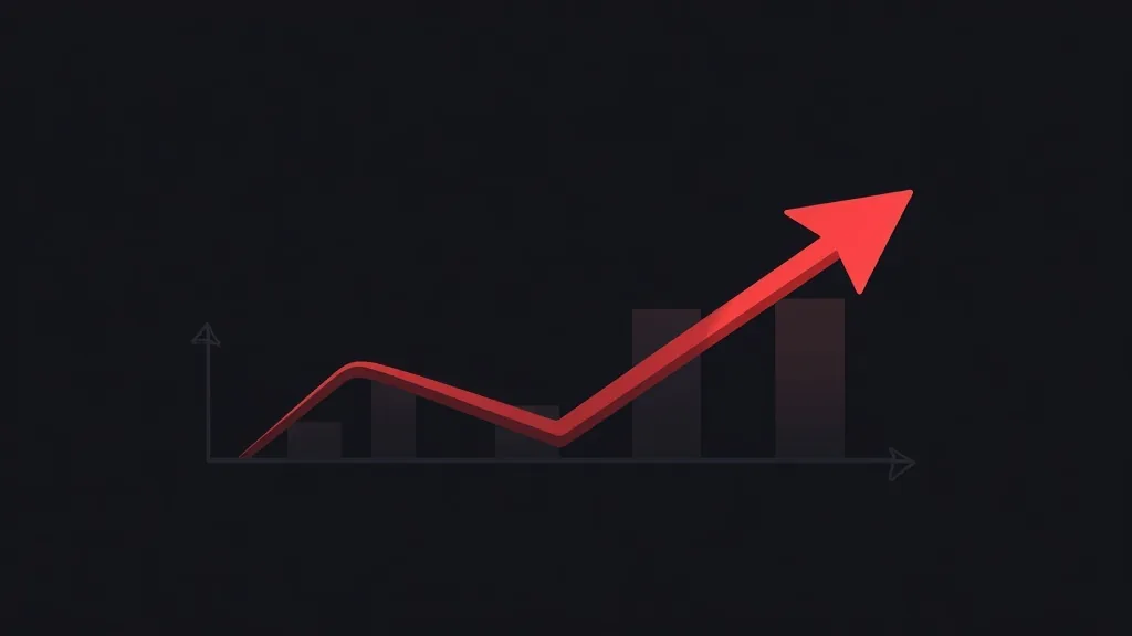
If your website converts at 1%, you are leaving significant revenue on the table. Moving that number to 3% may sound modest, but it means tripling the results from the same traffic. You do not need more visitors to grow. You need more of your existing visitors to take action.
The good news is that a 1% to 3% jump is realistic for most businesses. It rarely comes from one dramatic redesign. Instead, it comes from removing friction, sharpening your message, and testing changes methodically. This guide walks you through a proven strategy you can start applying to your own site this week.
Understand What Your Conversion Rate Really Tells You
Before you change anything, you need to understand what is actually happening on your site. A 1% conversion rate means that for every 100 visitors, only one takes the action you want, whether that is a purchase, a booking, a demo request, or a form submission.
The first mistake most business owners make is treating their site as a single number. In reality, your conversion rate is the sum of many smaller steps. A visitor lands on a page, reads your offer, considers it, and then either acts or leaves. Each of those steps is a place where people drop off.
Start by mapping your key conversion paths:
- Which pages bring in the most traffic?
- Which pages have the highest exit rates?
- Where do people abandon your forms or checkout?
Tools like Google Analytics, Microsoft Clarity, or Hotjar reveal exactly where visitors hesitate. Heatmaps and session recordings show you what people actually do, not what you assume they do. This data becomes the foundation for every improvement that follows.
Fix the Friction That Silently Costs You Sales
Most low conversion rates are caused by friction, the small obstacles that make it harder for people to act. Individually they seem minor, but together they push visitors away.
Speed is the first offender. If your page takes more than three seconds to load, a large share of visitors leave before they see your offer. Compress images, use modern formats, and remove unnecessary scripts. A faster site almost always converts better.
Confusing navigation is the second. When visitors cannot quickly find what they need, they give up. Simplify your menus, reduce the number of choices on key pages, and make the next step obvious.
Complicated forms are the third. Every extra field lowers your completion rate. Ask only for what you truly need. If you require a phone number, an address, and a company name for a simple inquiry, expect fewer submissions. Test cutting your form down to the essentials and watch what happens.
Mobile experience is often overlooked. More than half of your traffic likely comes from phones. If buttons are too small, text is hard to read, or forms are awkward to fill, you are losing mobile visitors by default. Test your site on real devices, not just a desktop preview.
Removing friction is usually the fastest way to lift conversions because you are not asking people to want your product more. You are simply making it easier for the ones who already do.
Sharpen Your Message and Your Calls to Action
A visitor decides whether to stay within seconds. If your headline does not clearly communicate what you offer and why it matters, they leave. Vague or clever messaging often fails because it makes people work to understand you.
Your headline should answer three questions instantly:
- What do you offer?
- Who is it for?
- Why should the visitor care?
Replace generic phrases like "Welcome to our website" with a specific promise, such as "Custom websites that turn visitors into customers." Speak to the outcome your customer wants, not just the features you provide.
Your calls to action deserve the same attention. A button that says "Submit" is weaker than one that says "Get My Free Quote" or "Start My Project." Action-oriented, benefit-driven language performs better because it reminds people what they gain.
Place your primary call to action where visitors can see it without scrolling, and repeat it naturally throughout longer pages. Do not make people hunt for the next step. Every important page should have one clear, obvious action you want the visitor to take.
Also reduce competing choices. When a page offers too many links and options, decision paralysis sets in. Give visitors one main path and remove distractions that pull attention away from it.
Build Trust Before You Ask for Action
People convert when they feel confident. If your site does not establish trust quickly, even a great offer will underperform. Trust is especially important for businesses selling to customers who have never heard of you.
Add trust signals throughout your key pages:
- Customer testimonials and reviews with real names and, where possible, photos or company names.
- Case studies that show measurable results you delivered.
- Trust badges such as secure payment icons, guarantees, or recognized certifications.
- Clear contact information so visitors know a real business stands behind the site.
Transparency also matters. Display your pricing when you can, explain your process, and set clear expectations about what happens after someone contacts you. Uncertainty creates hesitation, and hesitation kills conversions.
For e-commerce, reassurance around shipping, returns, and payment security can dramatically change checkout completion. For service businesses, a simple guarantee or a clear description of your onboarding process removes doubt. The goal is to answer the quiet objections running through your visitor's mind before they become reasons to leave.
Test Systematically Instead of Guessing
The difference between businesses that improve and those that stay stuck is testing. You should never assume you know what works best. Even experienced marketers are frequently surprised by test results.
Start with A/B testing on your highest-impact pages. Change one element at a time so you know exactly what caused any difference. Good candidates for testing include:
- Headlines and value propositions
- Call-to-action wording, color, and placement
- Form length and field requirements
- Page layout and the order of information
- The type of offer you lead with
Give each test enough traffic and time to reach a reliable result. Ending a test too early leads to false conclusions. When you find a winner, keep it, then move on to the next test. Conversion optimization is a continuous process, not a one-time project.
Document what you learn. Over time, you build a clear picture of what your specific audience responds to, which makes every future decision smarter and faster. This compounding knowledge is how businesses steadily climb from 1% to 3% and beyond.
Turn High-Intent Visitors Into Priority
Not all traffic is equal. Some visitors are ready to buy, while others are just browsing. To reach 3%, focus your best effort on the pages where high-intent visitors spend time.
Product pages, pricing pages, and service detail pages usually attract people who are seriously considering a purchase. Optimize these first. Make sure they load fast, answer objections, and lead clearly to the next step.
You can also recover visitors who almost convert. Exit-intent offers, follow-up email sequences, and retargeting help bring back people who left without acting. A visitor who abandoned a form or cart is far more likely to convert than a brand new visitor, so it pays to have a system that re-engages them.
By concentrating on high-intent moments, you get more return from the same optimization work.
Conclusion
Moving your website conversion rate from 1% to 3% is one of the most efficient ways to grow your business, because you are unlocking value from traffic you already have. There is no single trick that gets you there. Instead, it is the combination of removing friction, clarifying your message, building trust, and testing your way to steady improvement.
Start with the data to find where visitors drop off. Fix the obstacles that cost you sales. Make your offer and calls to action impossible to misunderstand. Reassure people with genuine trust signals, and let testing guide your decisions rather than guesswork. Each improvement adds up, and together they can transform your results without a single extra dollar spent on traffic.
If you want expert help auditing your site and building a conversion strategy tailored to your business, our team at Beeglantee can help you turn more visitors into customers. Reach out and let us find the gaps that are holding your conversions back.