Studija slučaja · Brending
Store chain branding
Visual identity and strategic positioning for a network of retail locations.
- Klijent
- Kolibri
- Industrija
- Retail and e-commerce
- Godina
- 2025
- Trajanje
- 30 days
Polazna tačka
Izazov
Kolibri needed a clear visual identity that would set it apart in a competitive retail sector.
What wasn't working
- Inconsistent communication - existing materials lacked a unified visual language
- Weak recognition - the brand name got lost among generic retail brands
- Undefined character - customers couldn't identify a specific brand personality
- Visual confusion - no clear symbol tying all touchpoints together
The bottom line
Without a clear identity, the brand was losing recognition and differentiation in a saturated market.
Naš pristup
Rešenje
We focused on creating an iconic symbol that directly connects the name to its visual representation.
Identity moves
- Stylized letter K - transformed into a hummingbird silhouette through sharp, modern lines
- Stark typography - a clean, contemporary font as the primary typeface for strong legibility
- Vivid red palette - #F72A2A as the dominant color that grabs attention and creates energy
- Minimalist elegance - a balance between modern edges and the organic form of a bird
The effect
The new identity created instant recognition through a unique combination of typography and symbolism.
Tipografija
Glasovi brenda u pikselima
Primary
Stark
Stark is a modern geometric sans serif font that is an ideal choice for primary typography in the retail and e-commerce sector. This font is especially suited to digital media, branding, user interfaces, and web design.
Strengths
- Geometric legibility - With clean geometric lines and uniform character widths, Stark delivers a balanced and harmonious look
- Digital optimization - Its commitment to simplicity and readability makes it a typographic masterpiece for the digital age
- Flexibility - It can be used for both headlines and body text, with five weights and five italic variants
Tone of voice
A brand using Stark sounds sophisticated and modern, communicating strength and a minimalist approach through clean lines.
Best for
- E-commerce headlines - Distinctive typography for logos, branding, headlines, and large text
- Digital platforms - Ideal for user interfaces, web design, and branding of digital media
- Marketing content - Great for creating promotional content and marketing graphics that grab attention
Secondary
CaviarDreams
CaviarDreams is a geometric sans serif font created by Lauren Thompson in 2009, and it is free for commercial use. It has aspects reminiscent of other geometric sans serif fonts, especially the combination of circular letters and an angular e that recalls ITC Avant Garde.
Strengths
- Distinctive geometry: It combines a modern and geometric design with subtle curves and slightly compressed letters that give it an elegant, sophisticated look
- Unique forms: Unlike other sans serif fonts, it has unconventional shapes - especially the capitals B, D, J, W, as well as a rotated lowercase e and lowercase w that resembles a capital W
- Excellent spacing: It has wider letter spacing, making it legible for both large headlines and small text
Tone of voice
A brand using CaviarDreams sounds modern and approachable, with a touch of elegance that isn't pretentious - ideal for e-commerce where you want to feel reliable but not cold.
Best for
- Logos, headlines, posters, apps, websites
- Headlines, captions, articles, content, ads, presentations
- The numbers are clear and recognizable, and the special characters well defined
Paleta boja
DNK identiteta, kliknite za detalje
Red
PrimaryThe red #F72A2A is an excellent choice for the primary color of the Kolibri brand because it grabs attention at first glance and signals action - which is exactly what you need from an e-commerce brand.
What it conveys
- Urgency and action - red in an e-commerce context is associated with special offers, discounts, and CTA buttons that need conversion
- Energy and dynamism - the intensity of this shade perfectly reflects the speed and liveliness a hummingbird represents
- Trust in transactions - many successful e-commerce brands use red because it signals seriousness and a stronger market position
- Standing out from the competition - if your category is dominated by blues and greens, red makes you visibly different
What feelings it evokes
Red (especially this saturated) triggers a sense of urgency and the desire to do something right away. Consumers respond faster to buttons, banners, and promotions in this color. At the same time it conveys strength and reliability - which matters when buying online.
Best for
- CTA buttons - "Buy now", "Add to cart" - red will always have a higher click rate
- Promotional banners and sales - discounts and offers need to pop, and this color is perfect for it
- Header or side navigation - as the primary brand color, it brings the user back to important parts of the site and strengthens recognition
Ivory
SecondaryIvory (#F7F7F7) is the ideal secondary color for Kolibri because it provides a clean, minimalist background that doesn't distract from the main messages, while keeping the design modern and approachable.
What it conveys
- Cleanliness and order - a light, non-aggressive color lets users focus on products and content
- Professionalism - slightly softer than pure white, ivory looks considered and refined
- Spaciousness - it visually opens up the interface, especially important in e-commerce where information complexity is high
- Neutrality - as a secondary color, it doesn't compete with the primary or accent colors but reinforces them
What feelings it evokes
Ivory gives the customer a sense of reliability and simplicity. Users perceive it as pleasant and easy to read, which reduces cognitive load when browsing the catalog or filling the cart.
Best for
- Section backgrounds - separating product groups, filter panels, or categories without visual noise
- Spacing and padding - between elements so each product and its detail stands out
- Secondary CTA buttons - for actions that are a lower priority than the main conversion
Logo concept
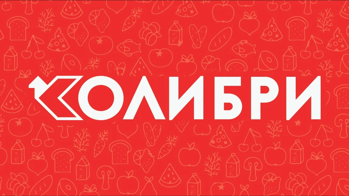
The logo merges typography with iconography by transforming the letter K into a stylized hummingbird silhouette. Sharp, modern lines preserve the letter's legibility while creating a recognizable bird form.
Glas brenda
The tone of communication is energetic and modern, reflecting the speed and agility of a hummingbird. A direct approach without unnecessary ornament, focused on a clear message.
Identitet uživo
Kako brend deluje u svetu
Retail and e-commerce
Kolibri
Visual identity and strategic positioning for a network of retail locations.
Retail and e-commerce
Kolibri
Set u Stark
2025
Bilbord · Print
Visual identity and strategic positioning for a network of retail locations.
Kolibri
Moodboard
Vizuelni jezik brenda
Spremni za svoj brend?
Pomoći ćemo Vam da kreirate identitet koji ostavlja utisak. Fontovi, boje, glas i sve što čini brend prepoznatljivim.