Studija slučaja · Brending
Diabar Pet Shop
Nostalgic character in modern pet shop branding
- Klijent
- Diabar
- Industrija
- Retail and e-commerce
- Godina
- 2025
- Trajanje
- 30 days
Polazna tačka
Izazov
Diabar Pet Shop started with branding built on the owner's personal memory of an old film.
What wasn't working
- Unclear storytelling - the link between the crow from the film and the pet shop stayed a mystery to customers
- Vintage without focus - the old-fashioned approach felt dated rather than authentic in a digital setting
- Inconsistent application - the concept of the screaming crow had no clear guidelines for different touchpoints
- Weak brand recall - customers didn't connect the visual identity with the quality of products and services
The end result
The brand was losing recognition in a competitive pet shop market dominated by generic approaches.
Naš pristup
Rešenje
We developed a strategy that blends nostalgia with functional branding for the pet industry.
Identity moves
- Darling Coffee typography - delivers vintage charm that reflects the film heritage while staying legible
- Saffron as the hero color - a warm, energetic shade that evokes joy and care for pets
- Minimalist crow - a simplified shape that works in small formats and digital applications
- Comfortaa for body text - a modern, friendly font that balances the vintage headline approach
The effect
The identity now communicates care and expertise while keeping the founder's distinctive story as a differentiating value in the market.
Tipografija
Glasovi brenda u pikselima
Primary
Darling Coffee
Darling Coffee for the Diabar e-commerce brand
Darling Coffee is a hand-drawn cartoon font that radiates warmth and a friendly tone, created by Khurasan. It's characterized by irregular letterforms with softer, rounded ends, capturing the charm of spontaneous hand-drawn sketches.
Strengths
- Approachability: Smooth lines and gentle curves create a warm and approachable look that makes your brand less corporate and more human
- Legibility: A playful, rounded font design ensures good legibility despite its decorative character, which is key for e-commerce
- Versatility: A modern and cute display font, perfect for posters, logos, magazines, book covers, banners and digital uses
Tone of voice
When Diabar uses Darling Coffee, the brand sounds like a friend recommending products to you - it's designed to bring a smile.
Best for
- Primary headings: Perfect for branding, packaging, and social media where it needs to stand out
- Logo and brand identity: The cartoon character makes the brand more memorable in the saturated e-commerce competition
- Marketing materials: Ideal for cheerful invitations and lively social media graphics
Body
Comfortaa
Comfortaa is a rounded geometric sans-serif font created by Johan Aakerlund in 2006. This font is intended for larger sizes and combines playfulness with precision through its smooth, rounded shapes.
Strengths
- Legibility at large sizes: Comfortaa is designed specifically for display purposes, which makes it great for headlines and key messages on the site
- Friendly tone: The rounded geometric shapes create a sense of approachability and warmth, ideal for an e-commerce brand that wants to feel close to customers
- Technical flexibility: It supports Latin, Greek, and Cyrillic scripts, with five different weights (Light to Bold) and variable font versions
Tone of voice
When Diabar uses Comfortaa, the brand sounds like a modern, approachable, and reliable partner in online shopping.
Best for
- Category headings and highlighted sections on the site
- Call-to-action buttons and important messages
- Logotype and brand elements that need to be remembered
Paleta boja
DNK identiteta, kliknite za detalje
Saffron
Primary#FFC435 saffron is the ideal choice for Diabar's primary color because it combines visibility with the warmth that builds trust with customers.
What it conveys
- Optimism and energy - The color feels approachable and positive, which is key in e-commerce where you want customers in a good mood
- Premium quality - Golden shades have historically symbolized value and exclusivity, which works for retail
- Reliability - It's neither aggressive nor cold; it feels warm and close, which builds a relationship with customers
- Visibility on small screens - Gold stands out on both light and dark backgrounds, which matters for mobile shopping
What feelings it evokes
Saffron brings a sense of well-being and small triumph, exactly what a customer wants to feel when finding something they like. It isn't cold like blue, but it isn't as unsettling as red.
Best for
- CTA buttons (Add to cart, Buy now) - Distinctive enough to draw a click without being jarring
- Product highlights - Use saffron for special offers or recommendations to make them stand out from the list
- Header and icons - As an accent color in navigation it makes the interface warm and human
Black
SecondaryThe black #0A0A0A is ideal as a secondary color because it offers maximum flexibility and legibility in an e-commerce setting. It can sit in the background without stealing attention, while at the same time boosting contrast and emphasis, making it perfect for textures, borders, and details.
What it conveys
- Reliability - e-commerce platform customers need to feel secure. Black signals that the brand is serious and professional
- Elegance and minimalism - in retail, less is sometimes more. Black lets products come forward without noise
- Neutrality - as a secondary color it doesn't compete with the primary but reinforces it
- Technical versatility - an excellent choice for icons, separator lines, footer, and typography
What feelings it evokes
Black feels controlled and sophisticated, which builds trust with the customer. In an e-commerce context that means the user expects the experience to be clear, without confusing elements.
Best for
- Text and typography - headlines, product descriptions, terms and conditions
- CTA accents - button outlines or loader animations that need to be visible
- Structural elements - lines between sections, icons, table headings in the product catalog
Ivory
SecondaryIvory is the ideal choice for Diabar's secondary color because it offers a visual rest without losing tension, which is key in an e-commerce setting where users spend attention in short bursts.
What it conveys
- Cleanliness and reliability - A light background signals transparency, which is especially important when checking reference prices or shipping information.
- Minimal visual noise - It frees the main content instead of weighing it down, making sales elements easier to scan.
- Professionalism without coldness - Unlike pure white (#FFFFFF), ivory has warmth and doesn't look sterile or futuristic.
- Flexibility for contrast - It works with dark typography, brand elements, and accents without hurting legibility.
What feelings it evokes
Ivory brings a gentle calm because it isn't harshly white, while at the same time strengthening trust through its lightness. The user subconsciously perceives the page as organized and worthy of attention, rather than plastic or generic.
Best for
- Secondary backgrounds - Sections for filters, sidebar, product departments, or offers.
- Element separation - Category cards or blocks with a subtle shadow to set them apart without aggressive division.
- Negative space - Areas between the main content where a bit of breathing room improves the browsing experience.
Logo concept
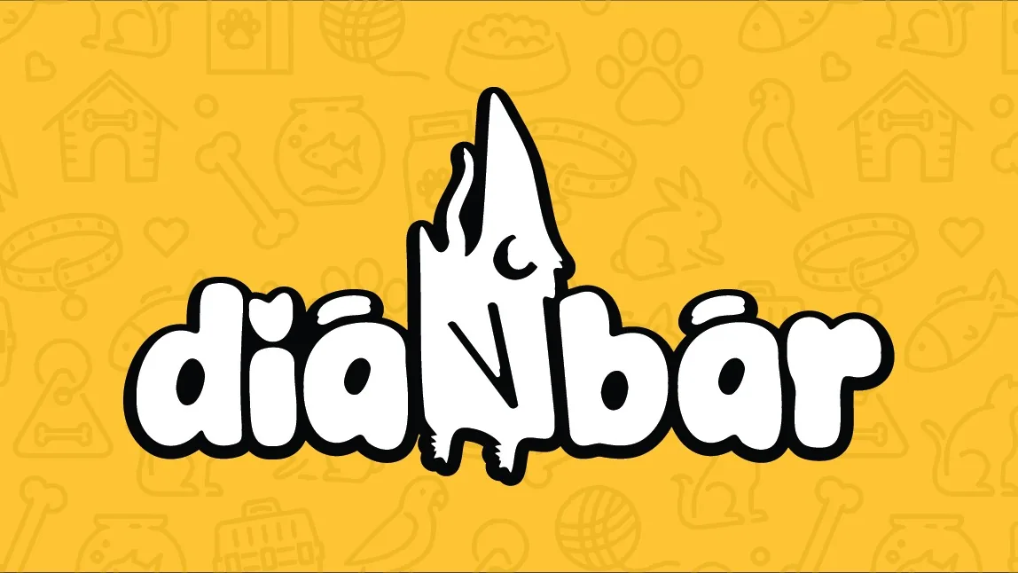
The crow is stylized into clean vintage forms that work in small formats. It combines a nostalgic reference with practical use in a pet shop context.
Glas brenda
A friendly, expert tone that combines a passion for pets with professional advice. It occasionally uses storytelling elements that circle back to the brand's film heritage.
Identitet uživo
Kako brend deluje u svetu
Retail and e-commerce
Diabar
Nostalgic character in modern pet shop branding
Retail and e-commerce
Diabar
Set u Darling Coffee
2025
Bilbord · Print
Nostalgic character in modern pet shop branding
Diabar
Moodboard
Vizuelni jezik brenda
Spremni za svoj brend?
Pomoći ćemo Vam da kreirate identitet koji ostavlja utisak. Fontovi, boje, glas i sve što čini brend prepoznatljivim.