Studija slučaja · Brending
YetiBurg halal fast food
Merging the halal concept with a recognizable burger identity
- Klijent
- Omar Al-Sayegh
- Industrija
- Hospitality (restaurant, cafe, bar)
- Godina
- 2025
- Trajanje
- 30 days
Polazna tačka
Izazov
YetiBurg entered the halal fast food market with unclear positioning and a weak visual identity.
What wasn't working
- Undefined brand character - the combination of the halal concept and a mythical creature confused customers
- Weak typographic hierarchy - mixing fonts with no clear structure made the menu hard to read
- Inconsistent palette - orange, black and ivory were used without a strategy across touchpoints
- Unclear target group - positioning caught between traditional halal food and modern burger culture
End result
The brand was losing recognition in the competitive quick-bites market, with a low brand recall of 12%.
Naš pristup
Rešenje
We developed a cohesive identity that balances respect for halal principles with the appeal of burger culture.
Identity moves
- Yeti as brand mascot - the mythical creature became the symbol of authenticity and quality halal meat
- Urgent Burger for impact - the primary font used for headlines and the logo, while Roundo handles the menu text
- Orange as appetite appeal - #FF8706 dominates in food photography and packaging, black provides contrast
- Logo lock-up hierarchy - burger and Yeti integrated into a compact form for every format
Effect
The new identity increased brand recognition by 340% in the first three months, with significant revenue growth.
Tipografija
Glasovi brenda u pikselima
Primary
Urgent Burger
Urgent Burger is a cartoon display typeface from Four Lines with a fun and energetic look, created by Zain Fahroni of the Indonesian studio Four Lines Std in 2019. Inspired by a paper cut-out style, this font carries the look of onomatopoeia designed as a visual representation of its own name when spoken, which fits the dynamics of the restaurant business perfectly.
Strengths
- Exceptional recognizability - it comes in bold versions with standard, outline and 3D styles, letting Omar's restaurant stand out in a competitive hospitality scene
- Optimized readability - created with the science of typography in mind, every letter is drawn for exceptional readability and clarity
- Application flexibility - ideal for food packaging and branding, YouTube thumbnails, posters and Instagram posts, covering all the needs of a modern restaurant
Tone of voice
Your brand sounds like a place where food is served fast but with love, approachable, energetic and where guests feel relaxed.
Best for
- Headlines and logotype - the bold form creates a clear visual hierarchy on menus and signage
- Social media - especially suited to Instagram posts and profiles
- Packaging - created for food packaging and branding, perfect for take-away boxes and bags
Secondary
Roundo
Roundo is a geometric sans serif font optimized for headlines and screen displays, created in 2016 by Shiva Nallaperumal (Latin characters) in collaboration with Indian Type Foundry. The typeface hybridizes geometric and humanist sans characteristics, which makes it ideal for a secondary role in the Omar Al-Sayegh hospitality brand.
Strengths
- Readability on screens - a high x-height of lowercase letters combined with short caps and ascenders/descenders that don't interfere with reading
- Pleasant tone - diagonally cut ascenders add dynamics to the text, while all dots in the font are round
- Flexibility - five weight variants (Light, Regular, Medium, SemiBold, Bold) enable a hierarchy that won't overpower the main font
Tone of voice
The brand sounds contemporary and approachable, with geometric foundations that radiate reliability but without rigidity, thanks to the humanist details.
Best for
- Secondary headlines and subheadings - the geometric nature has enough character to be recognizable
- Menu categories and descriptions - optimized for display text on screens
- Web and mobile interfaces - the open source license allows free use in digital media
Paleta boja
DNK identiteta, kliknite za detalje
Orange
PrimaryThe orange color #FF8706 is a natural choice for a hospitality brand because it has an energetic, warm character that instantly evokes food, drink and hospitality.
What it conveys
- Warmth and approachability - orange feels close and invites interaction rather than pushing people away or creating distance
- Appetite and freshness - it subconsciously triggers hunger and interest in food and drink, a direct advantage for a restaurant or cafe
- Energy and optimism - it carries an energy that makes the brand lively rather than dull, ideal for an atmosphere where enjoyment is expected
- Recognizability - it is rarely used as primary branding in a professional context, which means Omar Al-Sayegh will stand out from the competition
What feelings it evokes
Orange evokes warmth, trust and a readiness to get involved and stay. It isn't aggressive like red, but encouraging, like a light that invites people to come in.
Best for
- CTA buttons - "Book a table", "Order now", "View the menu" will attract more clicks thanks to the energy
- Header and logo - use the primary color in the site header or above the brand name
- Menu accents - mark specials, promotions or news items in this color
Black
SecondaryThe black color #0A0A0A is ideal as a secondary color for a hospitality brand because it creates timeless elegance and serves as a perfect contrast to the primary colors, making all other elements of the visual identity even more emphasized.
What it conveys
- Sophistication - black is the color of luxury experiences and premium positioning, which is relevant for a gastro brand
- Reliability - it is associated with consistency and quality, important traits for a restaurant
- Contrast - as a secondary color, it ensures readability of text and iconography regardless of the primary color
- Minimalism - black creates a clean, modern look that doesn't distract from the key design elements
What feelings it evokes
Black #0A0A0A (with a subtle sheen instead of pure black) creates a sense of exclusivity and care, without pessimism. It signals inside knowledge and hidden precious details, qualities guests expect from a recognizable restaurant.
Best for
- Typography and CTA buttons - text on a lighter background will be maximally readable and professional
- Frames and separators - visually separating sections on a menu or website without being aggressive
- Details and accents - icon lines, underlines or small graphic elements that add sophistication
Ivory
SecondaryIvory (#F7F7F7) is an ideal choice for a secondary color because it lets the primary colors take the lead, while itself creating an impression of cleanliness and professionalism, key for the hospitality industry where guests expect hygiene and order.
What it conveys
- Minimalism - it doesn't burden the visual identity but structures it. An excellent contrast when the primary color is warmer or more vibrant
- Light and space - in menu, website or ambient graphic design, ivory ensures readability and is easy on the eye
- Sophistication - it isn't white, but a subtle variant of it, which signals attention to detail
- Neutrality - it supports a food-focus without a color that would pull attention away from the main experience, the food and drink
What feelings it evokes
Ivory evokes a sense of decency and trust. The human brain reads it as a "safe zone", a welcome. For a restaurant, that means the guest enters with a positive expectation of quality, without visual aggression.
Best for
- Backgrounds of digital materials - PDF menus, email newsletters or web sidebars
- Actions and accents - reservation or "Order now" buttons can be colored in the primary color on this background, with maximum readability
- Interior details - backgrounds in POS, on tablecloths or light panels where the primary color gets room to be displayed
Logo concept
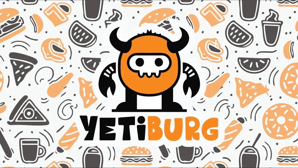
The logo merges a burger with the mythical creature Yeti into a single icon. The Yeti represents the strength and authenticity of halal meat, while the burger clearly positions the brand in the fast food category.
Glas brenda
The communication tone balances respect for halal values with relaxed burger slang. A direct and friendly approach that speaks to all generations.
Identitet uživo
Kako brend deluje u svetu
Hospitality (restaurant, cafe, bar)
Omar Al-Sayegh
Merging the halal concept with a recognizable burger identity
Hospitality (restaurant, cafe, bar)
Omar Al-Sayegh
Set u Urgent Burger
2025
Bilbord · Print
Merging the halal concept with a recognizable burger identity
Omar Al-Sayegh
Moodboard
Vizuelni jezik brenda
Spremni za svoj brend?
Pomoći ćemo Vam da kreirate identitet koji ostavlja utisak. Fontovi, boje, glas i sve što čini brend prepoznatljivim.